

Transparency and feedback in UX are all about making sure that the users of your application know what will be the effect of their actions – the ones they are going to take and the ones they have just performed. It helps to build trust in your product, especially in the case of new users. In less than five minutes, I’d like to introduce you to a few UX design patterns / ideas that will make your application more transparent and trustworthy for new and regular users.
How to recognise problems with transparency and feedback
It’s hard to generate metrics for transparency and feedback as they might be very subjective to different people interacting with your application. It is strongly connected with reliability issues. However, there are some symptoms you can find in the feedback from your users or your customer support:
- Users are not sure if the performed action is effective
- Users are trying to repeat the same action as they are not aware that they are already effective
- Users are asking about the current status of processes they are involved in
- Issues connected with conversion – too low or significantly dropping in certain funnels or stages
Addressing these issues can take time and effort on your team’s end, but what can you do to improve the situation as quickly as possible? Here are some general mobile UX patterns you can apply to improve transparency and feedback in an instant.
How to improve transparency and feedback in UX – general UX design patterns
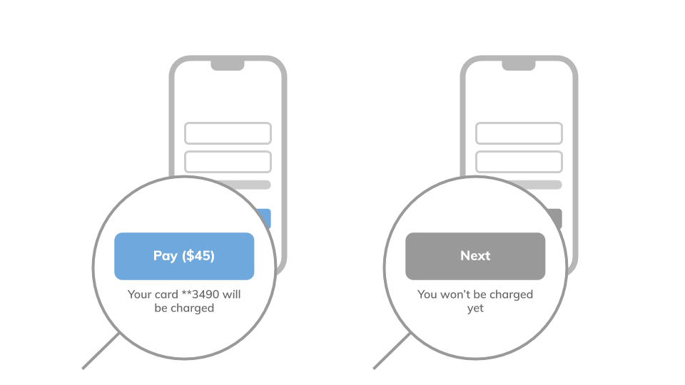
UX Pattern #1: Inform about the consequences
A fundamental good UX practice is to inform the users about the consequences of the action they are going to perform. It’s all about proper messaging in the UI, e.g. “Your card will be charged”.
You can also use an opposite pattern and inform about what will not take place. Like saying: “You won’t be charged yet” or “Your account won’t be opened yet”.

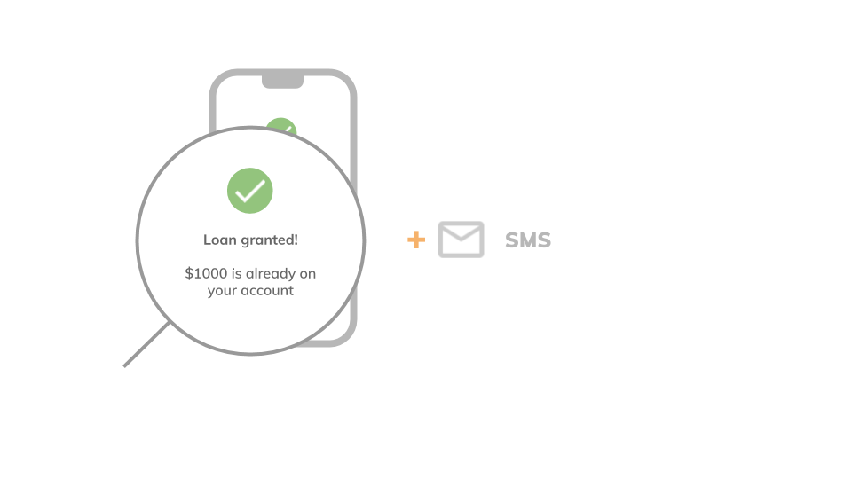
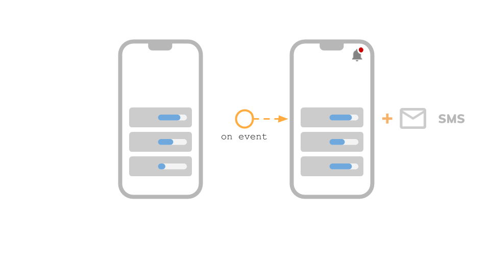
UX Pattern #2: Put communication channels to work
The second basic practice from our UX patterns is to inform the user about the consequences of a recently completed action. Apart from in-app notifications, you can increase user awareness of key actions by using additional messages in non-app communication channels (e.g. email, SMS).
UX Pattern #3: Explain what happens next
You may also try a different strategy – tell the users about what has just happened and what is the next step of the action they are going to take. Additionally, you can show how long the user will need to wait for the next step to be completed. Make sure users are aware of any delays occurring in the process – it’s always a good UX practice.
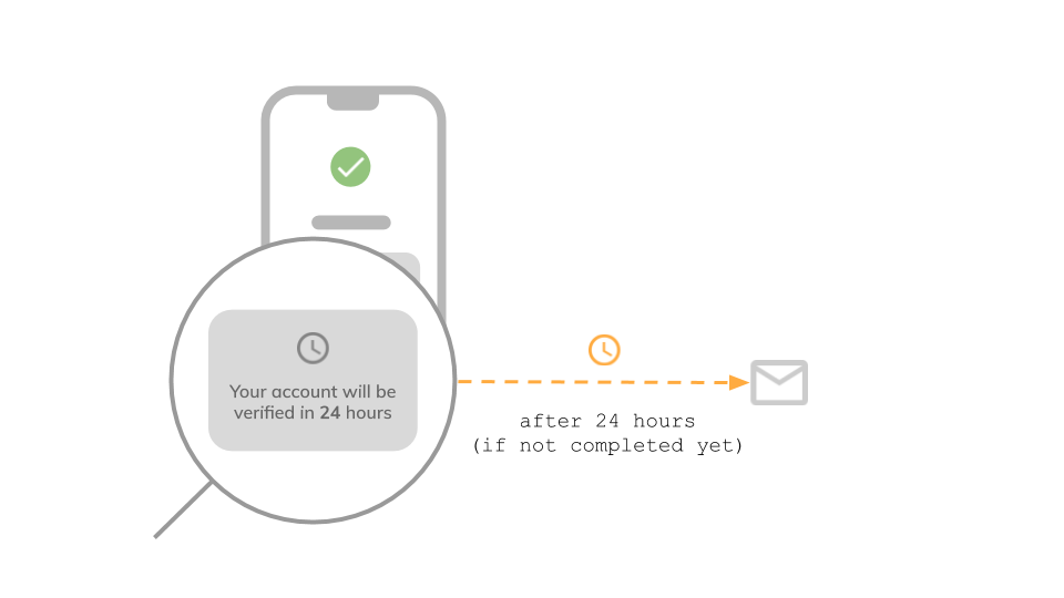
In addition to this, you can also notify the users about their progress in the whole process, giving them an idea not only about the next step but about all of them.
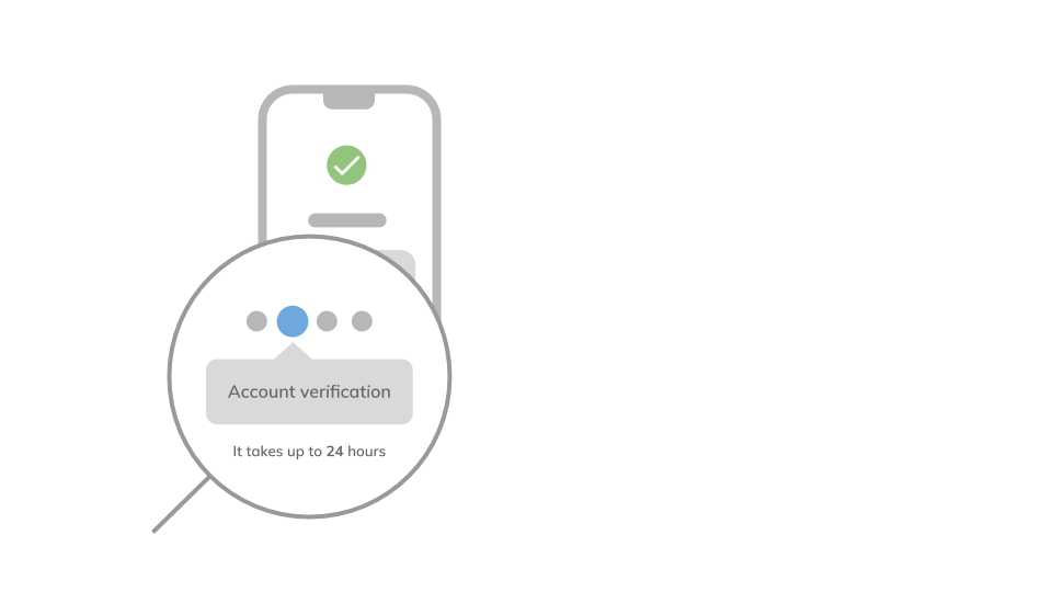
UX Design Pattern #4: Show what’s in progress
Another valuable UX design practice involves providing the user with clear information about all ongoing processes. So when the users leave an app and come back after some time, they can easily find this information. It’s really helpful to improve this feature with non-app notifications (like email notifications) informing about all important events and changes in the process. Especially when the user action is required.
Wrapping up
Transparency and feedback in UX can affect your product in a significant way – both positive and negative. To make sure you’ll enjoy the first scenario, there is no other way than to measure whether the related features are actively used. If you notice gaps or discrepancies in user flows, it’s time to take a closer look at how your application processes are displayed and communicated to the users and ensure they understand it clearly enough to trust your product. I hope the UX design patterns above will help you create a product that attracts new users and build their trust in it.
You need more tips? See also our other article, about Design Principles in UI/UX in FinTech.