Investing in property doesn’t have to be a complicated maze of legal activities and incomprehensible processes. United4 is a crowdfunding platform for real estate investments, aimed at both individual and corporate investors. While the platform was still in its pre-development stages, Code & Pepper was tasked with creating specifications as well as UX/UI design for the platform. After all, you can’t successfully break down complex financial processes without a deep dive into the user experience.
About United4
With United4, even beginner investors can easily find flexible and convenient investment opportunities without the need for exhaustive industry knowledge. The real estate crowdfunding platform will offer various types of affordable and secure property investments to both individual and corporate users. The idea behind United4 was to make real estate investing simple and accessible to investors with different levels of experience and financial capacity. When it was time to turn the idea into a product, United 4 chose Code & Pepper to prepare specifications and create a UX design with the perfect feel for their platform.
Challenges
During the first workshops with United4 it became clear that the product is going to be quite complex. In the planned, final version of the solution it was dedicated to two very different markets and various types of target users that would require different functionalities. However, the client’s top priority was to prepare the platform for development as quickly as possible. That meant that the Code & Pepper team needed to carefully select the most value-added aspects to work on at the design and specification phase.
Because starting the development fast was so important, it was key to prioritise the right functionalities from the sea of interesting ideas. The team also had to take into account the services offered by United4 might be a novelty for the target audience and the users might need to be educated about property crowdfunding first.
From the design point of view, Code & Pepper had to make sure that the presentation of the platform’s offering would be easy to understand. The platform should also showcase the available properties in a way that would promptly draw the users’ attention. Finally, as expected in FinTech, the collected data had to be shown in a digestible and transparent manner. It should also allow for running various analytics, depending on the user’s needs.
With all that in mind, we gathered our experts to provide United4 with an elegant, intuitive design and solid specifications that would kickstart the next phase of the project.

Solutions for United4
The team in charge of design and specification consisted of a project manager, product owner, UX/UI designer, and software architect. We worked closely with United4 in a series of workshops to get a better understanding of their business goals and product vision. We also regularly sent the United4 team completed elements for review and approval. Their swift responses and feedback gave the project an extra boost and allowed for smooth communication.
The final outcomes of our work for United4 served as a clear direction for further development of the app. We never lose from our sight what matters most for our clients — time-to-market. At the end of this stage United4 received not only designs but also a detailed product backlog. With the outcomes of the design and specification phase, the anticipated development stage could promptly begin… led again by Code & Pepper.
Time-to-market mindset to keep priorities straight
To get the first development sprints started as soon as possible, at various stages of design our team would identify features necessary to implement in the MVP. At the same time, we would flag functionalities that needed to be included in the post-MVP iterations of the app. This prioritisation was key to effective design and, later, development.
As we worked on the design and workshopped with United4, the client also decided to focus the MVP around one user group — the individual investor. This decision impacted what we would include in such materials as the User Story Map and what tasks we prioritised for development.

Treating user expectations with utmost care
In most cases, it’s not enough for a product to solve a particular pain point for the user. The app itself has to be intuitive and simple, especially when the service offered tackles complex issues. The straightforwardness of the product needs to be reflected in the interface and the way the user is supposed to interact with the app. Without understanding what the target user hopes to gain from the product and what actual problems they want to solve, even designs with the best ideas behind them can fall short of user expectations.
Working on the United4 designs, we also kept in mind that our client’s target market is likely to require some education. Real estate crowdfunding, while a solution that can appeal to many, hasn’t yet reached everyone who might benefit from it. Before we could set out to plan any flows within the app, we dove deep into the needs and expectations of our client’s target audience.
These workshops and analysis resulted in user personas, a lean canvas, and value proposition.
When creating the user personas, we examined both individual and corporate investors, learning what the app would offer in response to their needs, what might hinder them from using the app, and how we can address these doubts. We also determined what tasks the two user groups will typically perform within the app and what main features their anticipated behaviour should translate into.
Within the value proposition we further broke down the users’ desired actions, expected obstacles, and resulting app features. We also analysed what each user group wants to gain from the app and how we can make it happen through design.
Next, we created a User Story Map. Here the anticipated user interactions with the product got connected with specific pages in the app. We mapped out what users might want to achieve in a given spot, such as the dashboard or the properties catalogue.
Then we planned the user’s journey throughout the app — from the moment they learn about United4 to managing their account and investments. The map also entailed specific actions the users could perform on a given page and what information they would see.
Clear UX design that highlights key information for the user
When it came to the actual look of the app, our team was again mindful of the fact that the average individual user might not be the most versed in real estate investing. These investors would want to learn more about potential properties and easily navigate the investing process. Additionally, the corporate user values easy access to analytics so they can track their ROI and KPIs.
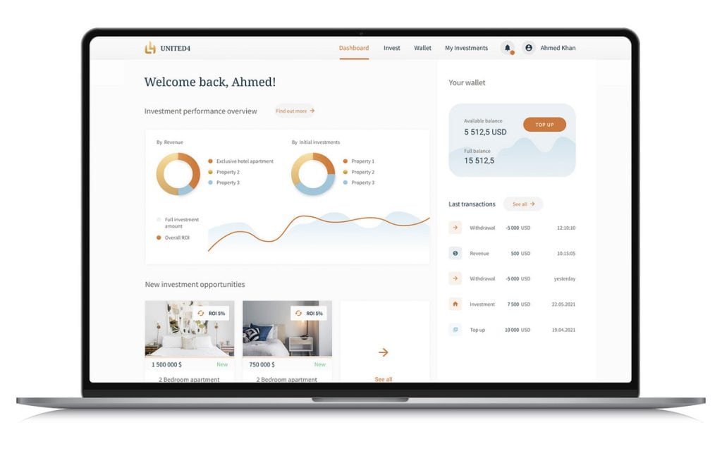
The design combines these real needs without overwhelming users with too much data. The dashboard presents the user with an overview of key information on the app:
- how their investments are performing,
- their wallet balance,
- a summary of last transactions,
- a preview of new investment opportunities.
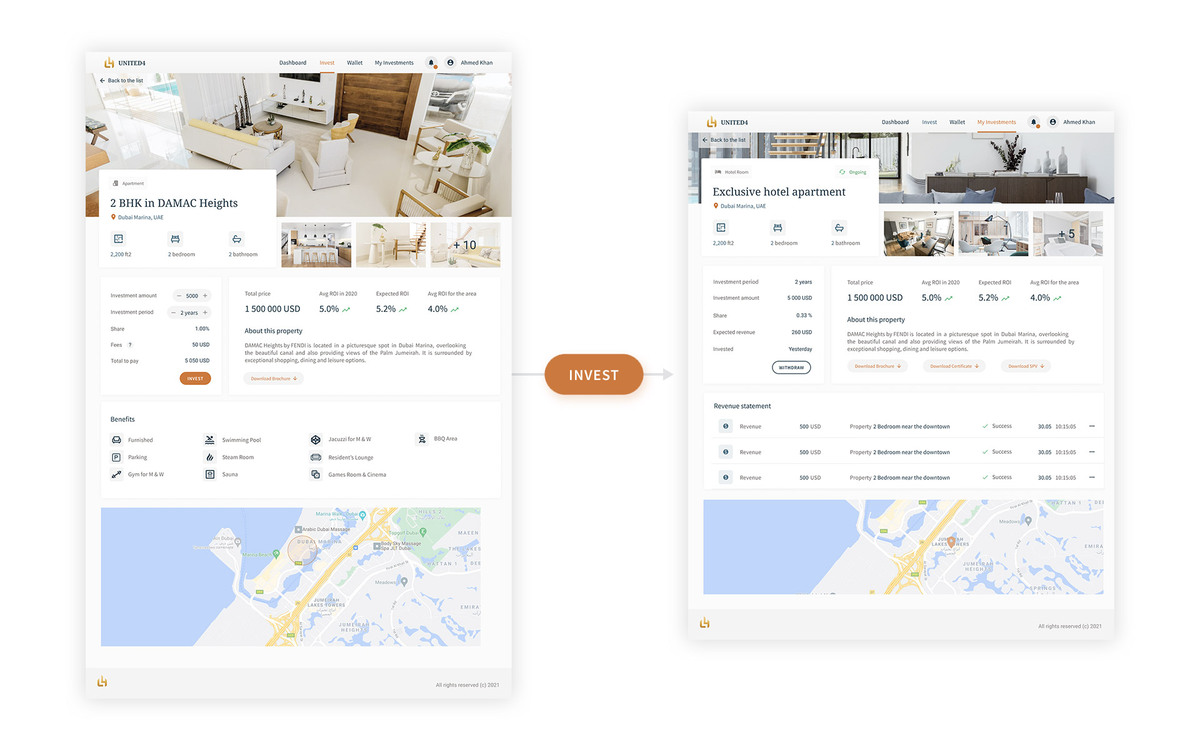
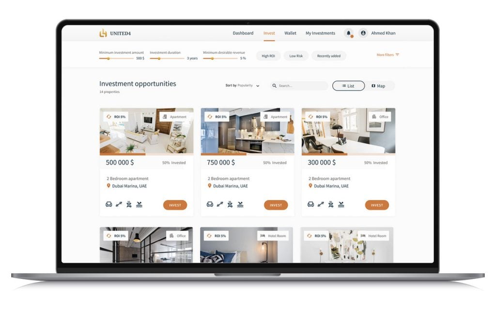
Next, the database of real estate investments can be easily filtered, and the individual properties can be seen in more detail. Even though the previews as well as the individual profiles need to convey quite a lot of information, everything is neatly presented, making it easy for the user to choose the right property for them. What could easily end up as chaos of information is instead an attractive and digestible catalogue for investors of all experience levels.
We also created designs for:
- the landing page,
- the log-in page,
- a page to manage the user’s investments,
- the Wallet page.
With the look of the app established on key pages, additional designs would be done during development to speed up its start.
Secure architecture for the win
Apart from making sure that what the user sees catches their eye, we took care of what goes behind the scenes. Our team proposed various solutions to ensure the app and stored data would be completely safe.
We devised code and solution architecture that would suit the product and the client’s business objectives best. The team also covered a permission list for different types of admins required by the processes for managing properties, users, and transactions. Permission lists were also prepared for the two user groups along with requirements for registration and KYC processes.
Ready for development
The design and specification stage resulted in a Product Backlog, a list of tasks for the development team to deliver the MVP, as well as a First Sprint Backlog. The client had a transparent knowledge of what was going to be done next and what they could expect at what stage. With these documents, the development could begin right away, just as the client wished.
Turn your business concept
into a product destined for success
From UX design to end-to-end development, we’re here to make your product thrive with sleek looks and features that win users over.


Global Trade Alert

UI/UX makeover and end-to-end development of a data monitoring and analytics web platform