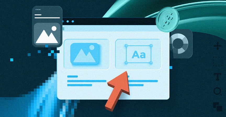
Creators that don’t implement a dark mode UX in their applications, leave them in the dark. One of the most interesting trends in recent web design is making sure that the product works for everyone. For those who prefer bright displays and those who want to reduce eye strain, especially in the dark. Benefits start there but the list of advantages is longer. What are they and how can you use them to serve the audience?

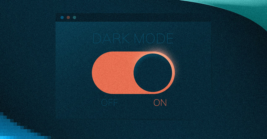
Table of contents
- The benefits of dark mode web design
- Challenges while designing dark mode UX
- What to consider when going for a dark mode design?
- How to do it right?
The benefits of dark mode web design
We have already mentioned the first – keeping it easy on the eyes. Some users prefer a dark theme design because it doesn’t fatigue the eyes so much. Keeping it dimmed means it’s more comfortable to use in dark environments or at night.
The second reason is also important – battery life. Traditional light background “allows” the app to drain the battery faster. Dark mode UI maintains necessary usability while making sure the device is powered for a longer period of time. In fact, the dark mode design is praised by Google itself. The company confirms that keeping the screen dimmed helps extend power consumption and battery life.
Challenges while designing dark mode UX
The first thing that might come to mind is that dark equals black. Unfortunately, using pure black is counterintuitive for many users since their eyes hurt while looking on a truly dark screen. Instead of using pure black, implement dark grey. That will let you express a wider range of color depths.
The second challenge is the right presentation of graphical hierarchy. It’s easy with a light mode but tricky under a dark mode web design. You can’t use shadows to increase range but lighter greys can do the trick.
Enhancing portions of design no longer work. With colors, specialists will simplify the message and even steer the user in the right direction. All call-to-action buttons (CTAs), account data representation flows and other important experiences are easy with myriads of colors. Dark mode UX uses subtleties instead. Lighter greys and clever use of white space make the difference.
Text and data readability may suffer a lot. There are many natural arguments to go with a bright background. Contrast and clarity of displayed information plus users’ habits go a long way here.
Avoiding saturated colors on dark themes is also a good idea. They can look great on white surfaces but vibrate against a dark background. The remedy here comes in the form of light tones, which are not that expressive.
Provoking emotions and creating various emotional tones are natural with a light display. Connecting with users under dark mode web design is harder. Muting out the app’s appearance makes it not only difficult to talk with users but also creating a strong brand in the first place.
Especially in FinTech, which is all about transparency and trust. Making people do something within the app (set up the account, prolonge subscription, make an additional purchase) can be slightly difficult when everything around is dark. The right display of the company’s logo is a thing to consider, no matter the rest.

What to consider when going for a dark mode design?
User experience is at the forefront of everything designers do. You can rely on a seasoned partner and their UI design expertise but industry knowledge is also important. Platform holders not only allow the dark mode in third-party applications, they also work with developers to provide the best possible outcome.
One of the examples is Apple who some time ago changed the meaning of UI styling and colors in iOS. Apple has introduced “semantic colors” for commonly used UI components. The goal behind the move was to balance the appearance and customer feeling of the iOS application in both light and dark modes. While these colors have mediocre RGB value, they directly change the iOS interface style. They also help with the overlay color and text.

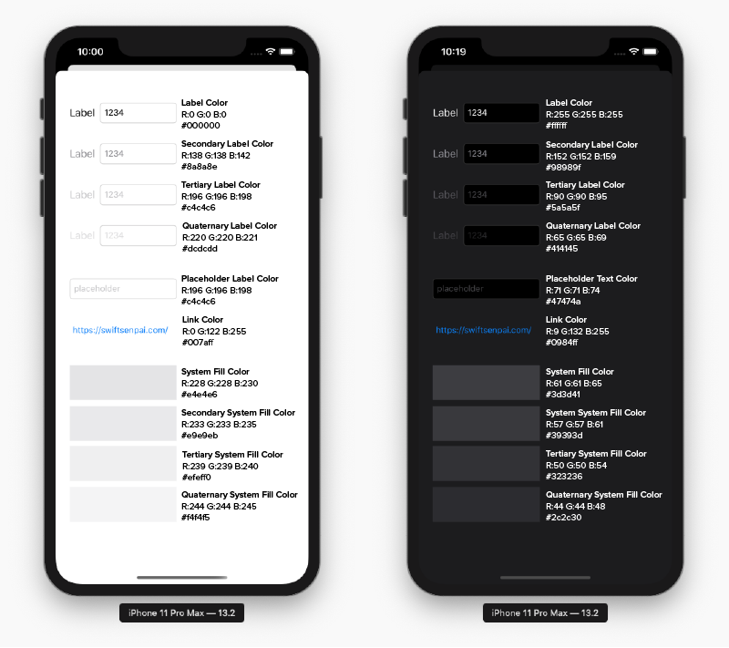
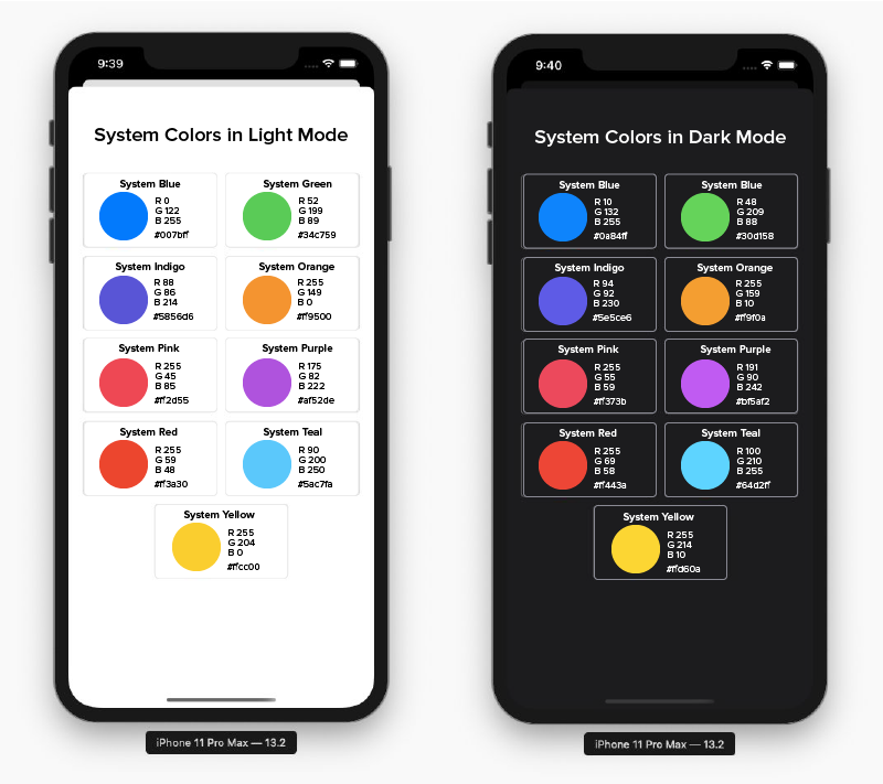
Apple also brought system colors to the table. These are nine predefined system colors that support dark mode design appearance and dynamic.
With iOS 13, Apple has also introduced vibrancy and blur effects that complement dark design while automatically adapting to the iOS interface style. Remembering about could also enrich the design.
One major thing is also worth noticing – a dark mode design affects not only text but illustrations and animations as well. If the app uses heavy graphical elements, it would be good to desaturate the background colors to make graphical content stand out. It’s all about putting the right focus (and the light, pun intended) on important elements.
If you’re still in doubt – use these Google’s dark mode design for material design guidelines to help you out.
How to do it right?
There are some myths in UX/UI design. One of them is that the user interface expresses how the product looks. Instead, a user interface is about translating mental models to visuals. Designers turn users’ habits, behavior, expectations and thinking patterns into what is displayed on the screen. With dark mode design, some things may be considered especially tricky since a variety of options is limited. FinTech software development is not easy under these conditions but it’s totally manageable.
First, clearly state your business goals and what the application can do for users. Then, put an emphasis on limiting the number of functionalities. If something is for everything, it’s good for nothing. Finally, approach your software development partner with questions. The design & spec phase of the development is dedicated to discovering your product. The more your partner knows about you, the idea behind an application and the needs of your audience, the more accurately can make your app. That also applies to a dark mode design.