

Designing an app to be user friendly is a must, right? User-friendliness is not a simple term, though and its complexity is actually gigantic, when you take a better look at what it involves. One of the key aspects one needs to understand and consider from the very beginning of work on an app is user experience friction and its three main areas: emotional friction, interaction friction and cognitive friction. Read more to find out what they are and how to avoid them.

Out of all problems users encounter, many are purely technical and related to how an app performs, how it crashes and glitches. However, from a developer’s point of view, UX is mostly about how an app should be designed to provide users with a pleasurable, smooth experience. To make it happen, designers must consider all sorts of variables and do their best to avoid their biggest enemy—UX friction.
What is user experience friction
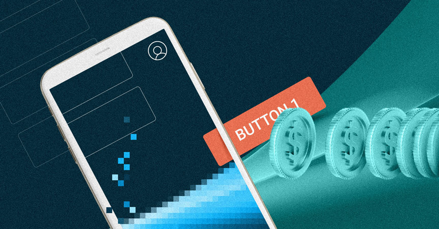
Simply speaking, UX friction can be anything that makes it difficult for users to accomplish their goals when using software. Friction occurs, for instance, when an app is not intuitive enough, when its interface is not designed in a clear, understandable way, when it does not function properly or when actions require too many steps to be completed. Such problems obviously lead to frustration, reduced conversion, abandonment and, ultimately, choosing a better app. Ultimately, most of the popular apps are designed from scratch with an average user in mind and are as simple to use as possible. Just take a look at Uber (we will come back to it later in this article). There are so few buttons on the screen, yet it works so well and requires no explanation.
User experience friction comes in different forms, shapes and sizes
There are three basic types of UX friction:
- Emotional friction
- Interaction friction
- Cognitive friction
Each of them refers to different types of problems users encounter in apps, and needs to be diagnosed with different tools.
Emotional friction
The most complex category of UX friction is emotional friction. It refers directly to how users feel when using an app and how these feelings affect their decision to stop using it. It’s often the hardest to spot the emotional factors that cause UX friction and it requires very thorough behavioral tests and psychological observations. Once spotted, problems that cause emotional friction are also the most difficult to address.
The role of emotion is crucial in UX, as only happy users can help you monetize your app. What’s important, though, is that there are two types of emotional responses to consider:
- Negative emotional responses,
- Positive emotional responses.
In some cases, negative emotions can lead to a positive effect, but it happens only in very specific situations and only if they are intended by designers. For example, fear is desired in horror games. In general though, in conventional apps, designers’ goal is always to make sure users never feel bad while using their product. The customer should never be overwhelmed by too many options to choose from and seemingly complicated functionalities. The easiest way to generate positive emotions, then, is making sure no negative ones are evoked.
A great example of such design (or a design trend) is the Uber app and most of its clones. When you open such an app, you are always greeted with a very simple screen that offers only what you need – a field where you can place your destination.

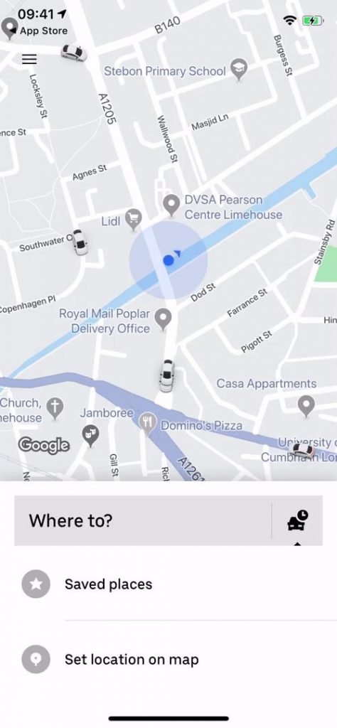
As there are no distractions, you don’t feel overwhelmed. Then, the app always shows you information about the price of the ride, and how long it will take for the driver to pick you up, so you are never stressed about the costs and being late. On top of that, you can usually see the name of your driver and their photo which evoke the feeling of trust. These simple, yet brilliant UX design decisions completely transformed the way we order taxis (or Ubers and similar services) and were quickly adopted by the competition worldwide (e.g. Bolt), ultimately to become the industry’s standard.
Interaction Friction
Designers always need to make sure the interfaces they create are uniform, intuitive and consistent across all of their windows and tabs. If they fail and users happen across situations where buttons have different shapes, but belong to the same category or where, for example, the back button is in different places on different screens, they may experience interaction friction (and, obviously, user’s confusion about how to use the app, as this feeling is imminent to all aspects of UX friction).
Probably the best way to show how reducing interaction friction caused a revolution is the way Apple has revolutionized the smartphone industry. Obviously, there existed smartphones before the iPhone on the market, personally I loved my Nokia E-series. But their interfaces were not letting their users utilize the hardware’s full potential, at least not in an easy way. Writing long emails on a cellphone’s keyboard was a pain in the neck and browsing the Internet on tiny screens was even more uncomfortable. Even if some phones had touchscreens, they only used a resistive technology that required pressing the screen with a substantial amount of force and preferably using a stylus for accuracy.
Apple’s decision to focus on minimizing interaction friction in their new mobile devices was a brilliant move and involved the following:
- Switching to capacitive touchscreens which offered unmatched precision and could be operated with bare fingers;
- A usable on-screen keyboard that made typing longer messages easy;
- A large screen and simple interface that made browsing the Web and consuming media fun;
- An official app store that offered over 100,000 titles by the end of 2009, compared to fewer than 1000 in Nokia’s Ovi store and to literally zero in the case of Windows Mobile based devices, the choice and quality of apps available for the iPhone was astounding.

And this is how by minimizing interaction friction (in other words: making using all of the device’s functions simple and intuitive), Apple has changed the smartphone market forever and made this category of mobile devices a standard that everybody loves. Not only for the versatility (because Symbian and Windows Mobile-based devices had been similarly versatile before), but mainly for their ease of use.
Cognitive friction
Have you ever been surprised after clicking a button or activating a function in an app? Well, let me be a bit personal with you and tell you a story of an annoying case that keeps happening to me every other week. I promise this perfectly illustrates how cognitive friction affects users.
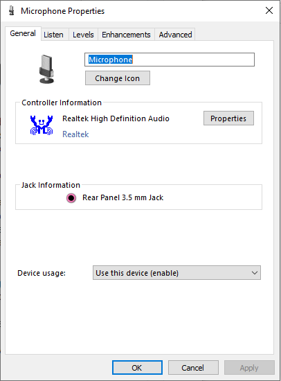
When I’m trying to change the microphone boost in Windows 10, I always just type microphone in Start menu and press enter, because that’s how I always open apps or games and find the settings I need.

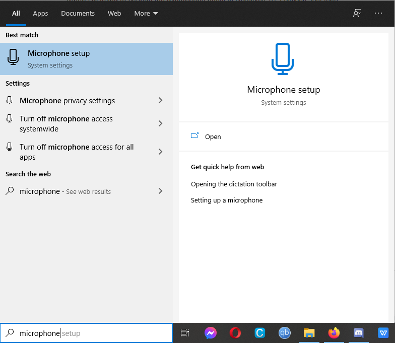
This time, however, Windows shows me a speech recognition settings window. But I just want to adjust levels! In order to do that, I need to manually find the sound settings window by right-clicking the volume icon, scroll down to input, then enter device properties, find the related settings section and click additional device properties. Finally, I can find the levels tab in the window that appears on the screen after this long operation. I have done it dozens of times already, but it always confuses me how illogical the whole procedure is. It’s a labyrinth and literally the definition of UX friction.
Six steps instead of two are way too much, especially when there is so little logic put in designing the user journey and when you need to deal with two different types of interface in order to perform one task – Windows 10 settings are still not uniform and the final window where you actually change boost still looks like straight from Windows 98 (interaction friction alert!). After almost 23 years it seems comical.

The whole problem starts with a great example of cognitive friction, though. I, as a user, believed that typing microphone and pressing enter will work analogically to typing resolution, as it obviously opens the screen resolution settings window.
The product designer’s goal is to make sure a situation like this one never happens. If I had to spend so much mental effort to simply order an Uber, I would just call a taxi corporation or choose a better app instead. Summing up, cognitive friction occurs when too much mental effort is needed to perform a task. Dear designers, just keep it simple and everything will be alright.
Is user experience friction always a bad thing?
Some friction is sometimes necessary and users learn to appreciate it. Detailed explanations of what certain functions do increase the time needed to use them, but make users sure that they understand the app. The same applies to pop-ups with confirmation buttons that ask the user to re-confirm their decisions. In some particular cases, for example in FinTech apps, where wrong decisions cost money, it’s very responsible to make the user think twice before clicking a button. But this is a topic for another story, so stay tuned for new posts on the Code & Pepper blog soon!