You are in the dark and complicated labyrinth. You can barely see the sun, the path has twists and turns and there’s no exit to be found. Backtracking seems to be the only option now. Retreating and finding a new path seems to be logical, and cost-effective. To save you from the headache, we have prepared this short but detailed FinTech UX and UI guide.

The FinTech industry is somewhat special. Every business out there should focus on the end-user and customer to generate revenue and build an attachment to the brand. When money is at stake, in the form of transferring funds or loans, things change. Brand fascination is replaced with trust as the number one factor. Everything should scream trust – from app design, through functionalities, to the overall experience. Let’s focus on the first, as it is the gateway to the whole application usage.
Major FinTech design principles
Designing for FinTech isn’t easy. There are multiple rules and landmines on the way. We will help you to navigate the most crucial ones, so your app can do what it does best – serve the user.
1. Understand the user and create for him, not for yourself
One of the major FinTech trends for 2021 is about focusing on people. Among other useful FinTech UX and UI tips is this – customer experience drives user acquisition. If the app is too complicated even on screens in the AppStore, it’s not worth it for the user. If there’s no onboarding or the process leaves question marks in the user’s mind, the app will probably get uninstalled.
Think about your target audience and real-life needs. For example – if the application helps people transfer money, design a one-step solution. Tap the button, the money is there. That simple. If the app is about lending money, explain the rates, possible insurance options, educate and confirm the process is secure.
2. Keep things as simple as they can be
Which brings us to the second point. Don’t overcomplicate things. Ockham’s razor rule should guide you through the entire process of designing an app. We should all remember that even without a complicated landscape of functionalities, screen design for every option, and tons of other headaches, there’s a small thing called compliance.
And that can be a major gamechanger for some. People turn from high-street banks because challenger banks offered a new take on personal finance and simplicity. Designing an app that requires from user tons of personal data, isn’t easy. Users will spend at least a few minutes on registration before the account is even opened. That’s why it’s always good to break registration steps into smaller ones. User will get a breather, and retention will be high.
3. Adapt content for devices across the board
Financial applications have to display a large amount of data. Not all of them are needed all the time, not all of them will be helpful for the user at a given time. The trick is to decide what the user will need at the moment, what to display, and how. We don’t always know how people will use the app. Through a smartphone, a tablet, a web version on the laptop? Precisely what device will they use? What brand, version, and screen size?
You can of course design for most devices. Buying a large amount of tech isn’t cheap, but it’s doable. Using emulators to simulate screens of the most popular brands, is a sane alternative. But these are only footnotes. The main issue – data should be easy to navigate and make sense for all. The last important thing – all screens should be scalable. If the user adds additional data (for example, for comparison purposes) it still should be readable and logical. Data is important only for statisticians, marketing specialists, and sports fans. For most people it’s boring – turn it into a useful tool!
4. Simplify and visualize data for transparency and ease of use
Moodboards help design cool dashboards but again – the average user couldn’t care less. A mother of three won’t care about a color palette, display schemes, and everything that FinTech web development specialists spend weeks and months to build. For her, the ability to calculate a home budget is the only thing in the world. At least when it comes to the app. That’s why it’s important to visualize numbers and correlations between them in a way that is informative and friendly.
If you can add gamification to it, even better. Because numbers are boring, people run for their lives and scream. If you present them in a way that generates engagement, people choose the app over traditional bank services. The power of FinTech product development comes from people understanding data. The way to do it lays in creating a story. There are many sources on how to visualize complicated concepts, “Storytelling with data” being one of them. No matter which one you pick, the goal is to ease the pain of use.
5. Avoid information overload
People should engage with the app, not to understand what it’s displaying at the moment and why. There are many ways to organize information on the screen. Subpages. Small chunks of data. Animations revealing context and additional information, with more numbers to follow. Each of them serves the purpose of keeping the user sane.
Don’t make people think about using anything inside the app. Books are for thinkers, mobile FinTech applications are for doers. Implement processes to know your customer better.
6. Make animations useful, not only beautiful
The product management interface is what the user sees and feels from the get-go. It can make or break the app. Think of animations as an ultimate FinTech UX and UI guide for the user. Smooth transitions (highly anticipated in the 120Hz refresh rate era) make the app more attractive but also help in navigation.
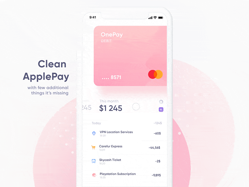
A good example is below. This ApplePay concept adds additional animations to help manage user’s debit and other cards from different companies. Like the Revolut or Amex, for example. It also serves as a manager for other cards, like Starbucks’ loyalty card. Quick transition, easy navigation, the seamless process of getting info. What else do you need while holding a phone in your hand on a rainy day? Think like that, down to earth and your app will be fine.

7. Don’t overload the app with copy and microcopy
Imagine you are the user. You are standing on a sidewalk, and talking to your wife about a newly discovered lending money app. The rates are great, the registration and lending process are transparent. You want to consult with your wife and quickly present the opportunity. How would you explain the entire process to someone that doesn’t see the app? What words would you use to convince the wife?
Simplicity is the key. To quickly look at the product and evaluate its use for personal usage; people need to have clarity. Graphical design is one thing, copy and microcopy are another.
Look at this screen from MoneyPark app:

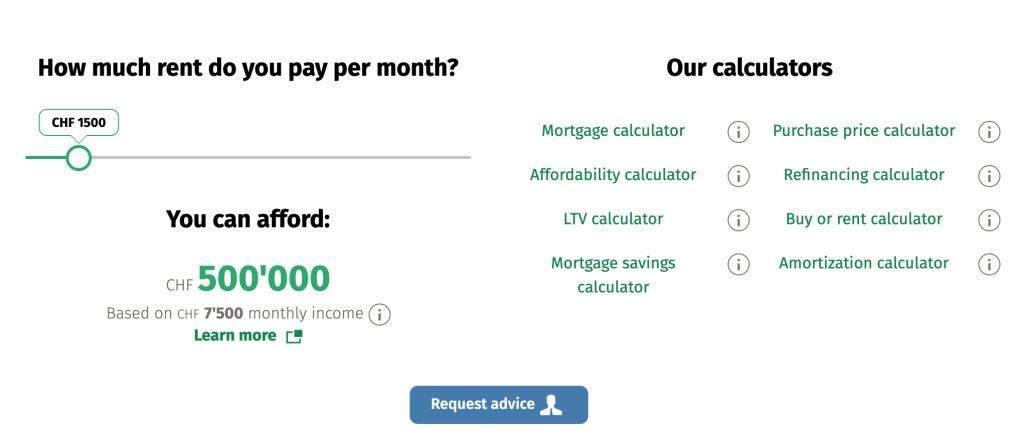
Being in husbands’ shoes, I would mention the ability to quickly check the credit rating. Honey, we could quickly count things – they have calculators for everything. Mortgage, affordability, refinancing… Plus, if there are any questions, they have advisors on board.
Too simplistic? Simple is good. Information on-the-go is good. I could hardly imagine a couple making life decisions on the phone, but putting seed out there, while talking about a useful app… while not? A copy doesn’t have to be beautiful; phrases can’t be a mouthful. Copy should serve as a quick and sharp explainer or reminder.
Last but not least – the language. It’s one thing to use proper copy, it’s another to actually engage with a living, breathing person. Let’s take a look at the Monzo app:

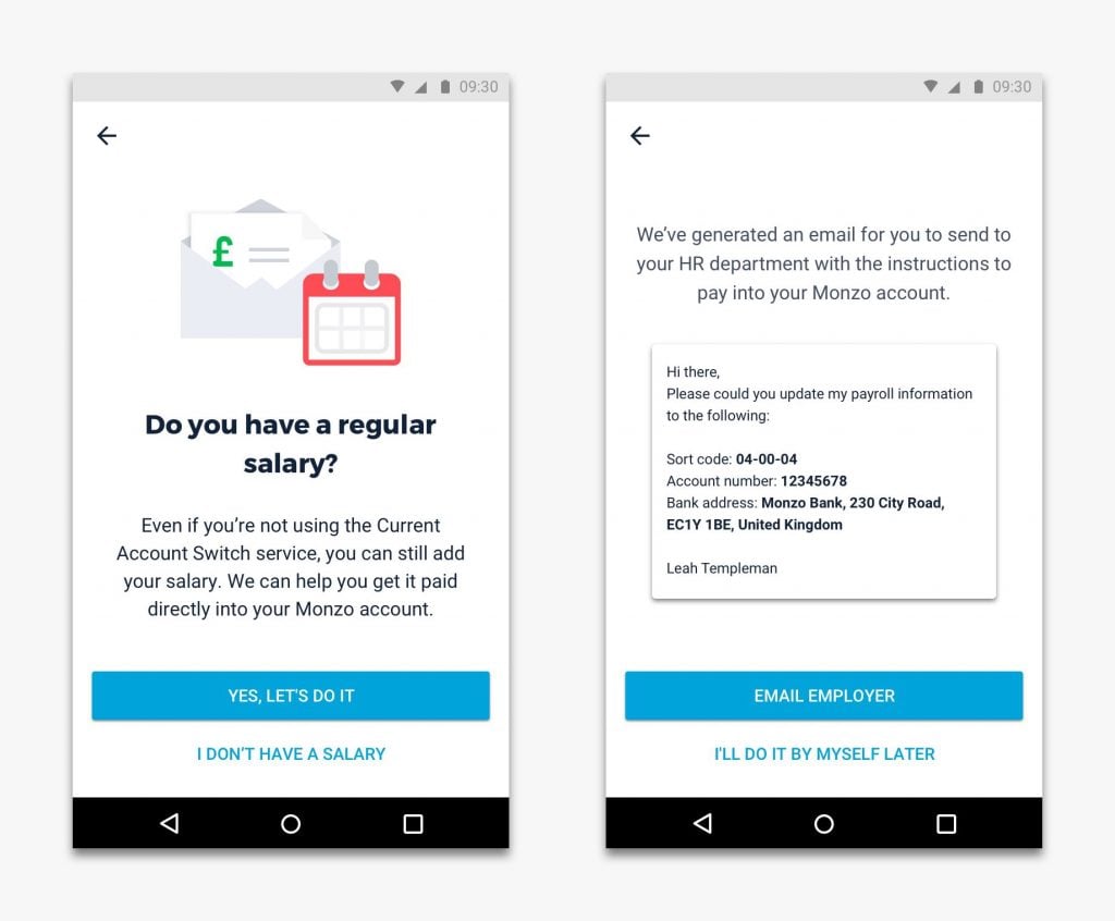
The first thing that comes to mind is a clear, conversational tone. It’s important because the king of FinTech’s UX trends is building a relationship. People don’t want to be treated like a claimant. They want a handy mobile tool and to be a part of a vibrant community. Is there something I don’t know? Community will have the answer. Is there a person in my neighborhood I can loan money from? The app will tell me. A proper tone of voice is crucial for any FinTech app.
Designing for FinTech? Shorten the distance, build trust and use emotions
To use a FinTech app, people have to put in personal information. Things like color palette, animation, and copy are important, but the overall feel is what counts. Traditional financial institutions are steadily losing the market to new FinTech platforms because it’s hard to quickly adapt. The FinTech user experience designers put the flow first. Learning and using a new app is a process. The shorter it will be, the higher chances for customer loyalty.
How to earn it? The FinTech design principles talk a lot about technical stuff, but what it all boils down to is one thing – making people feel secure and accomplished. Look how the Monese app communicates with the user:

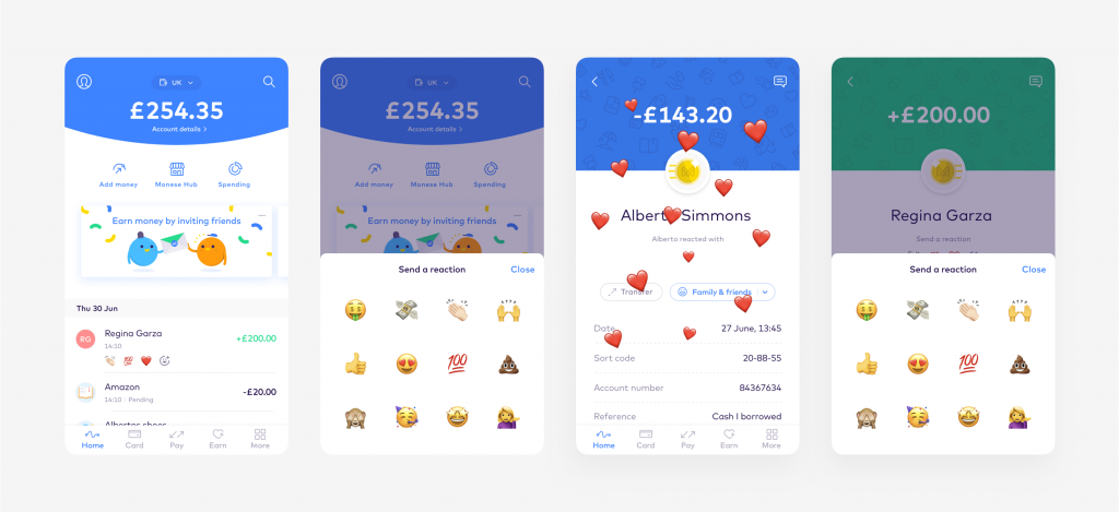
All these emojis and bright colors make the app easy to understand and friendly. People get instant feedback – yes, you did something right, this is how it’s done around here, you can communicate with others, etc. Can you imagine all these techniques in traditional financial platforms? Maybe not exactly, but banks are paying attention. You can now pay for Netflix for example. Still not hearts, but it’s a start.
Ariadne’s thread to the rescue
Looking for a straight path out of the labyrinth? Unfortunately, there isn’t one. As per the definition of the labyrinth itself – it has multiple paths to take. You can also go back, explore, and try a different route. This brief FinTech UX/UI guide does not exhaust the topic, but it’s a start. Especially for startups, which tend to have misconceptions about what works and what doesn’t and why. This article is the first part of Ariadne’s thread, the second one is already running through the maze… Stay tuned!