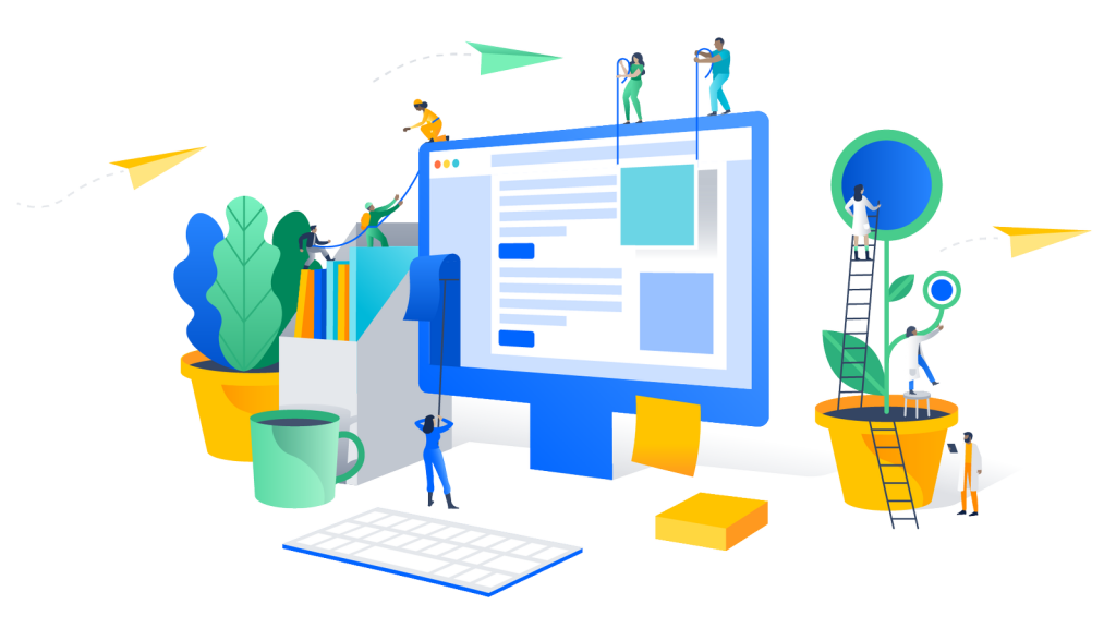
We all know LEGO bricks and pieces; many of us grew up having them and then passing the torch to our kids. With LEGO, we can dream and build anything: a car, a house, a castle, even a space station. From the smallest and most humble design to the most ambitious project—everything can be constructed with the right amount of supplies and patience. It’s possible because these pieces can be used many times over in different combinations. And this is the exact nature of the design system in user experience (UX).


What is a design system in UX and UI?
Let’s start with a potential surprise. The term ‘design system’ isn’t new: it was coined before the 2000s. What changed was the way we use it while creating web and mobile applications. The design system term is strictly tied with those and user experience, user interface (UI), creating interactions between an app and the human beign, and customer experience.
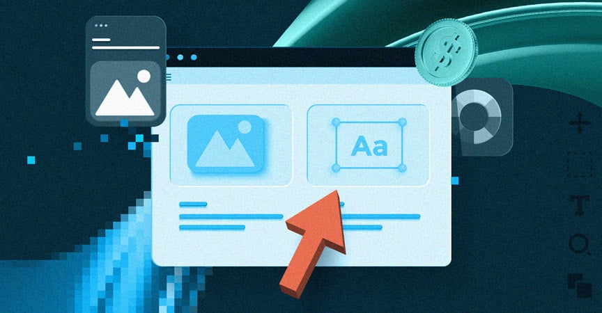
Design systems have their own elements: fonts, colour pallete, colour schemes, buttons, labels, inputs, etc. They occur in different sizes, variations, and models. Together, they are a part of a larger system, called a design language, which is an overall visual design of any digital product. As we have proven earlier, it’s easy to think about it as a giant pool of LEGO bricks. Even if you have only a limited number of them, you can still pull a giant number of combinations:

That’s how we have reached the scale problem.
An elephant in the room
If you have a small application with limited functionalities, it’s easy to maintain and make changes. The problem occurs in a big environment. What works for an ant, won’t work for an elephant. Design system help with large-scale projects. Especially, when everything should be internally consistent. An application should look and feel similar to the website. The website should mirror the company’s interactive presentation, etc. The entire portfolio should be consistent across the board, bringing the user to the conclusion that everything was designed with a specific theme and message in mind.
The bigger the system, the more challenges it presents. Not even technical, these will come later. Even earlier, when you have to design an application, questions will pop up. What’s the reason this button is blue, not red? Does this font have to be so big? Why on Earth do we use this outdated sound format? The UX design system provides an answer and creates order. In fact, the design system is often related to as a single source of truth for the entire design, development, and marketing teams. It groups elements (LEGO pieces) and allows the company to create, build, and further develop a digital product.
Boxes for LEGO pieces
If we put plastic pieces on the ground, it’s easy to forget about them. It’s a recipe for falling down or building an incomplete structure. That’s why graphic design system requirements are grouped in categories.
There are two main groups and we can call them:
Hard: components, patterns, labels, typography, layout, writing style and copy, company guidelines, brand book, etc.
Soft: brand identity and values, company culture, customer-facing reflection of them all.
When we have that, it’s easier to develop basically anything. More precise – to even start developing. One can argue that values and culture are nothing next to fonts and color palettes, but this “one” would be wrong. Without soft values and a shared mindset, a product design is only a way to develop a product. We can build something that works and looks great, customers can be happy, but only to a point.
What if something goes wrong? What if trends shift and customers want something different? What if these trends will force the team to even fundamentally change the application? That will cause even major changes – from new fonts to new and removed functionalities. If the initial market research was faulty, the entire app can undergo a serious redesign.
To help mitigate the discrepancies between versions of the app, it’s good to have a mature company culture. It also speeds-up the design, because everyone is focused on the customer and his needs. The app alone can be different (yet largely the same) but the core-values will prevail. And that’s the real competitive advantage.
Why are design systems important?
In a company where everyone speaks a different language, nothing gets done. Or is made with a horrendous cost to the process efficiency, not to mention money. To reduce these costs and build the Babel tower (also known as Really Big Application) you need the UX design system. When you finally have it, it can also be called a design language.
To speak it is to control the chaos. Especially in an agile environment, where changes occur all the time, and often product pitched early in the process doesn’t look the same at the end. Tracking all these changes requires consistency which design system in UX and UI provides. Thanks to that, all changes, future iterations, and next products are predictable. It’s important not only for the design system but also for the user. And again, especially in software Fintech development – the industry’s tremendous success in recent years is and will be based on creating a satisfying customer experience.
Good design system examples
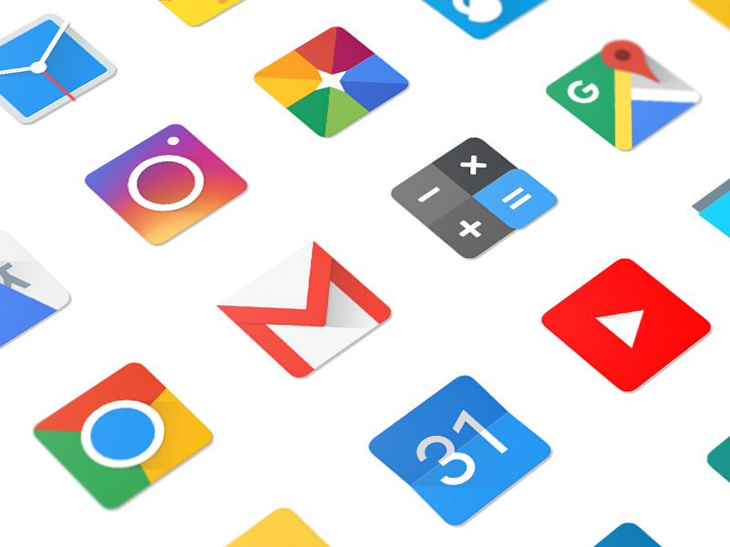
One of the most important standards out there. Material Design uses grid-based layouts, responsive animations and transitions, padding, and depth effects such as lighting and shadows. This design language is implemented throughout the entire company’s portfolio. It’s used by Google Sheets, Docs, YouTube, Chrome, Classroom, Maps, Slides, Translate, and more. Introduced in 2014, redesigned in 2018, with more usage of white space, rounded corners, colorful icons, and bottom navigation bars.
2. Atlassian
Atlassian is a company that delivers software for teams (like Jira, Confluence, and Trello). It has to be simple, intuitive, and allow a quick introduction to both: project scope and team member’s responsibilities. Guess what? Two of these statements are on the official company page dedicated to an explanation of Atlassian’s design system. You can learn more there, but first, let’s take a look at simplicity in action:

If it’s still not enough, you can learn more by watching an Atlassian Slideshare presentation.
3. Shopify
Shopify is a company that delivers ecommerce solutions. Shopify’s design system is called Polaris. It’s made to be highly scalable and easy to use. It’s focused on merchants’ experience, giving them a sensation of working with something that… well, works. What else do you need from a system that is made for selling things? And yet, other companies are struggling to create something that simple and impactful.
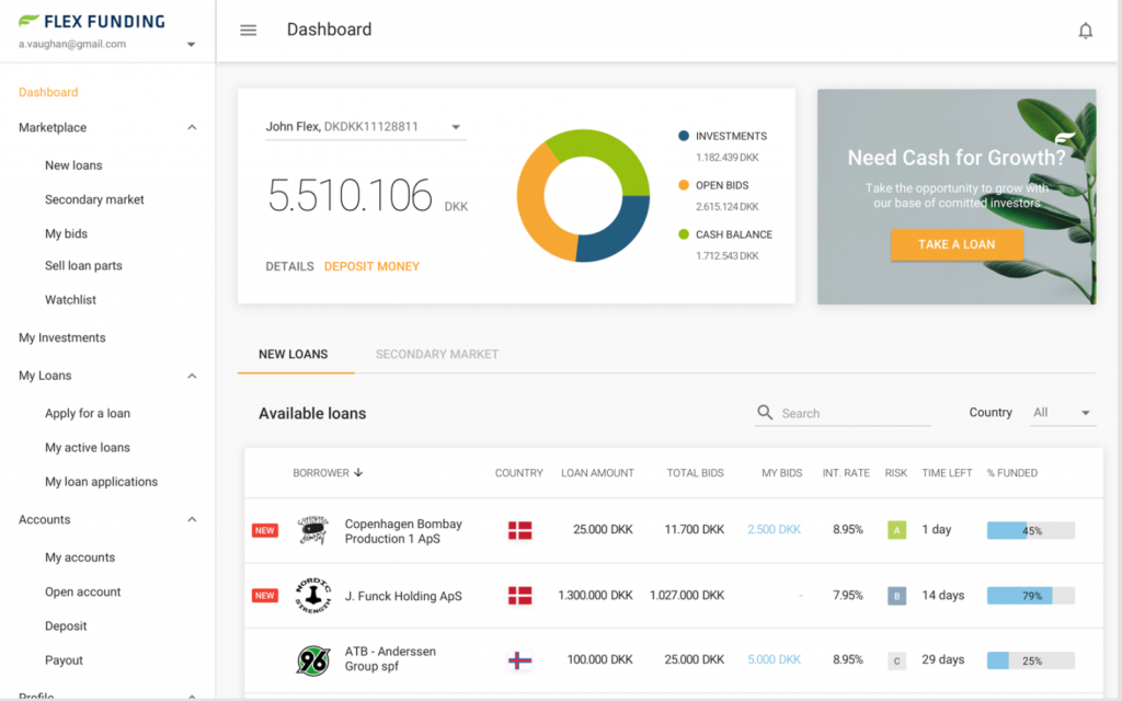
4. Flex Funding
Based on Google’s Material Design, the Flex Funding puts an emphasis on a intuitive solutions. It’s easy to implement responsive mobile approach to app. The UI is also easy and intuitive in everyday use. The usage of predefined blocks also means less advanced code on our part. There is also out-of-the-box access to themes, which let us prepare dark theme very quickly.

5. Apple
Oh boy. We could talk for hours about this one and at times, it would still be not enough. Apple’s human interface design guidelines are simple and powerful. Designed for millions, they provide an ocean-deep amount of knowledge and inspiration. Especially now, in the age of the Big Sur operating system that creates a bridge between desktop and mobile applications.
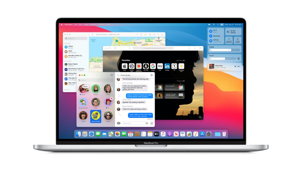
This whole new approach to design and product functionality gives us few valuable lessons:
- It’s good to test the app’s colour palette under different lighting conditions. Apple’s color guidelines clearly states that conditions vary and everything – from content to colours – can look different in many environments. Stating the obvious? Yes and no. The introduction of Big Sur and Apple’s Rosetta 2 translation environment means few things. Developers can simplify porting for apps. You can do one app and it will run on iOS, Watch OS, Mac OS, and iPad OS. Now through Rosetta 2 but soon natively, on Apple Silicon. One app on multiple devices but with multiple environments and lighting conditions. That’s especially important for FinTech mobile app development.
- Tailor your app’s appearance to the mode people choose in options. The dark mode is useful to many people. It goes beyond a simple darkening of the screen. It’s about looking out for the eyes, making content consumption easy and pleasant, etc. Apple’s dark mode guidelines expand on the topic.
- Show content right away. Or even faster, if it’s possible. Joking aside, Apple’s loading guidelines will tell you why. Long story short: “Don’t make people wait for content to load before seeing the screen they’re expecting. Show the screen immediately, and use placeholder text, graphics, or animations to identify where content isn’t available yet. Replace these placeholder elements as the content loads. Whenever possible, preload upcoming content in the background, such as while an animation is playing or the user is navigating a level or menu”.
Elements of a good FinTech’s design system UX
Forget everything we have talked about before. Just for a second. Now, all this fancy talk about colours, palettes, design languages is worth nothing if it’s not focused on a user. That’s why FinTech companies put UX and UI to work.
FinTech is all about security and simplicity. Most people are not tech-savvy. They will not be diving deep into the application to figure out how to do things. It has to work for them. Nothing less, nothing more. Plus, they need to feel secure. They need to know their deposits are safe and personal data appropriately taken care of.
There’s also a matter of time. People want to find an ATM quickly. And they want to seamlessly borrow or transfer money. What matters is the “instant reward” mechanism. You have downloaded the app; you have put an afford. Took interest. Now we give you opportunities available 24/7, at the click of a button.
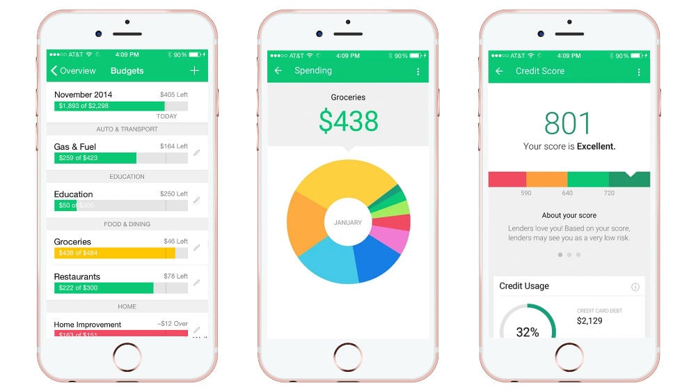
What companies cash in on this approach?
- Mint. Clear design, instant access to information on every screen.

- Actiwallet. How to present a wall made of numbers? As simple and transparent as you can.

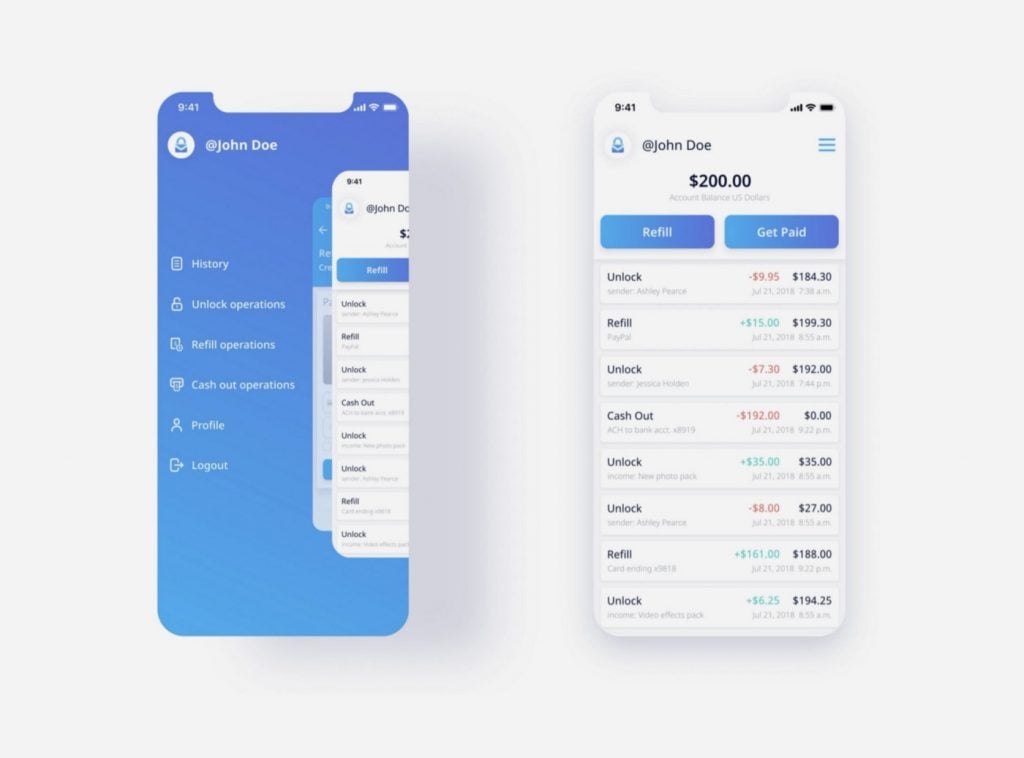
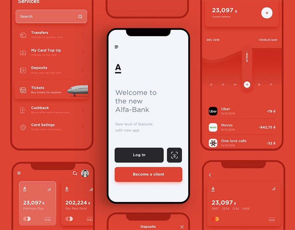
- Alfa Bank. Everything is clean, slick, logically planned. Perfect use of the screen.

Building the UX design system
It’s a book-size topic. The graphic design system requirements can and will be different for each company. Creating a design system should begin with analyzing the identity of the brand itself (values, culture, users, product, etc.) and then progress towards more technical topics.
The system can be:
- modular or integrated
- centralized or distributed
- single-minded (device-native) or dispersed across different devices (like today in the Apple ecosystem).
All these variables give additional headaches to the design team. We will address them all in future articles, so stay tuned for more.